Lakes Speciality Foods
Lakes Speciality Foods contacted me in the hopes of developing a new identity that truly represented their values and goals as a local, high-quality food supplier.
Initially, we explored their vision and what they wanted to communicate to their audience. Once we had established this direction, we moved on to developing their new look. A circular-based identity was specifically requested, and I got to work.
We decided to use a strong serif typeface, which helps to create a local and homely feel. Initially, we played around with various icons representing meat and dairy, such as a cleaver, milk and cows. However, we realised that the Lake District’s strong heritage, where LSF is based, provided a nice focal point.
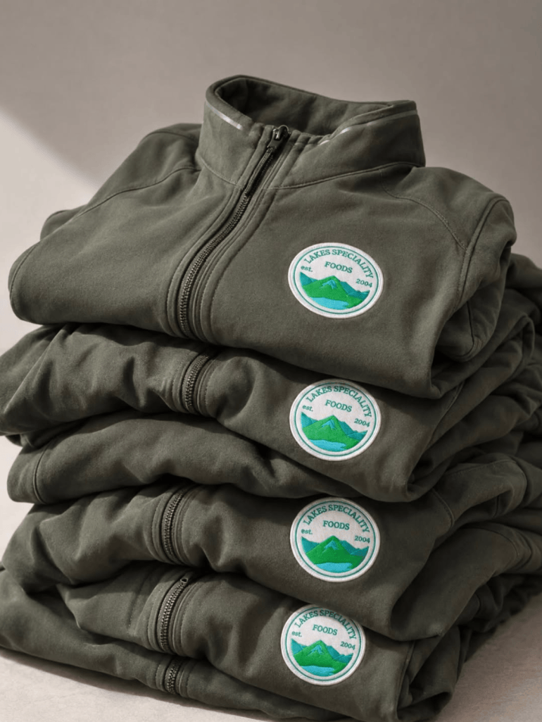
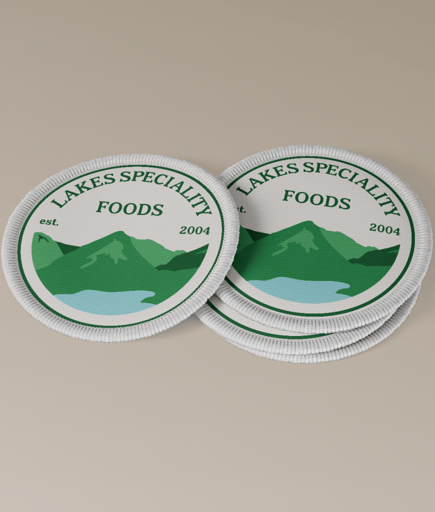
Images from branda uk
