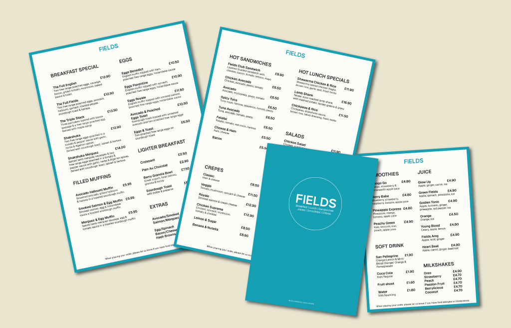
Fields Menu
I assisted Feilds Acton in the redesign of their menu. They were looking to incorporate colours that were a part of their brand’s current identity, so leaning into the teal blue, I designed a clean, simple and legible menu. The menus are printed on thick, textured card to create a high-quality feel.